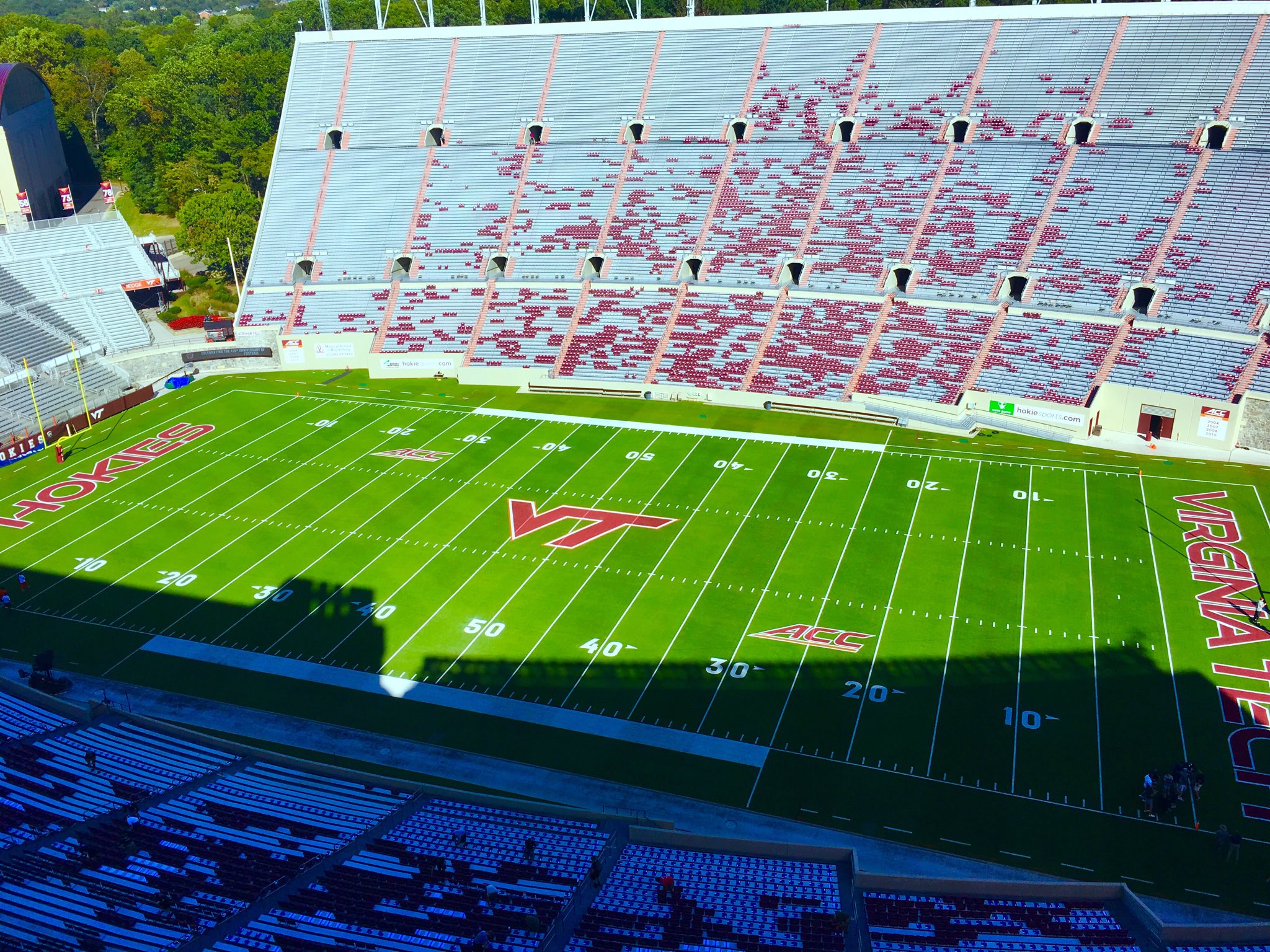
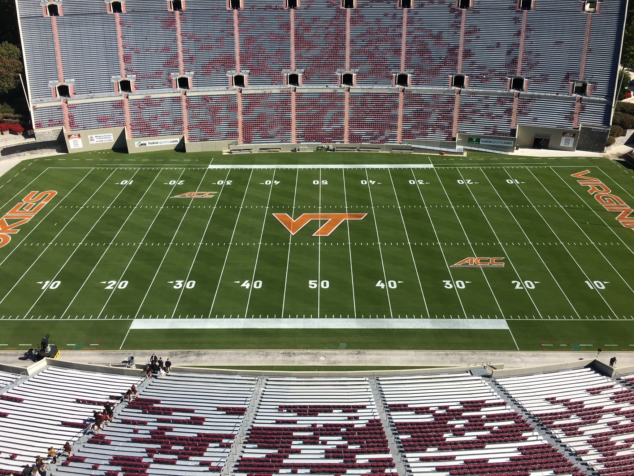
Last weekend we went through our annual Maroon Effect, and I know I have said it before, but I just can't let this go...

This should be our field design every week of the season. Maroon VT in the middle of the field, maroon wordmarks in the end zone. It just looks right. It just looks so much better, and stands out so much more against the white field markers than the white logo and wordmarks.
I'll go one step further and say we need to paint the end zones maroon with white text. It would look perfect:

With that being said, I specifically meant maroon when I said the field should be painted.... We should never, ever do this again:

Forums:
DISCLAIMER: Forum topics may not have been written or edited by The Key Play staff.

Comments
Please join The Key Players Club to read or post comments.
Please join The Key Players Club to read or post comments.
Please join The Key Players Club to read or post comments.
Please join The Key Players Club to read or post comments.
Please join The Key Players Club to read or post comments.
Please join The Key Players Club to read or post comments.
Please join The Key Players Club to read or post comments.
Please join The Key Players Club to read or post comments.
Please join The Key Players Club to read or post comments.